Lauren Gleisberg’s Happy, Healthy Life Printable Planner Review: Meet the New Kid on the Block
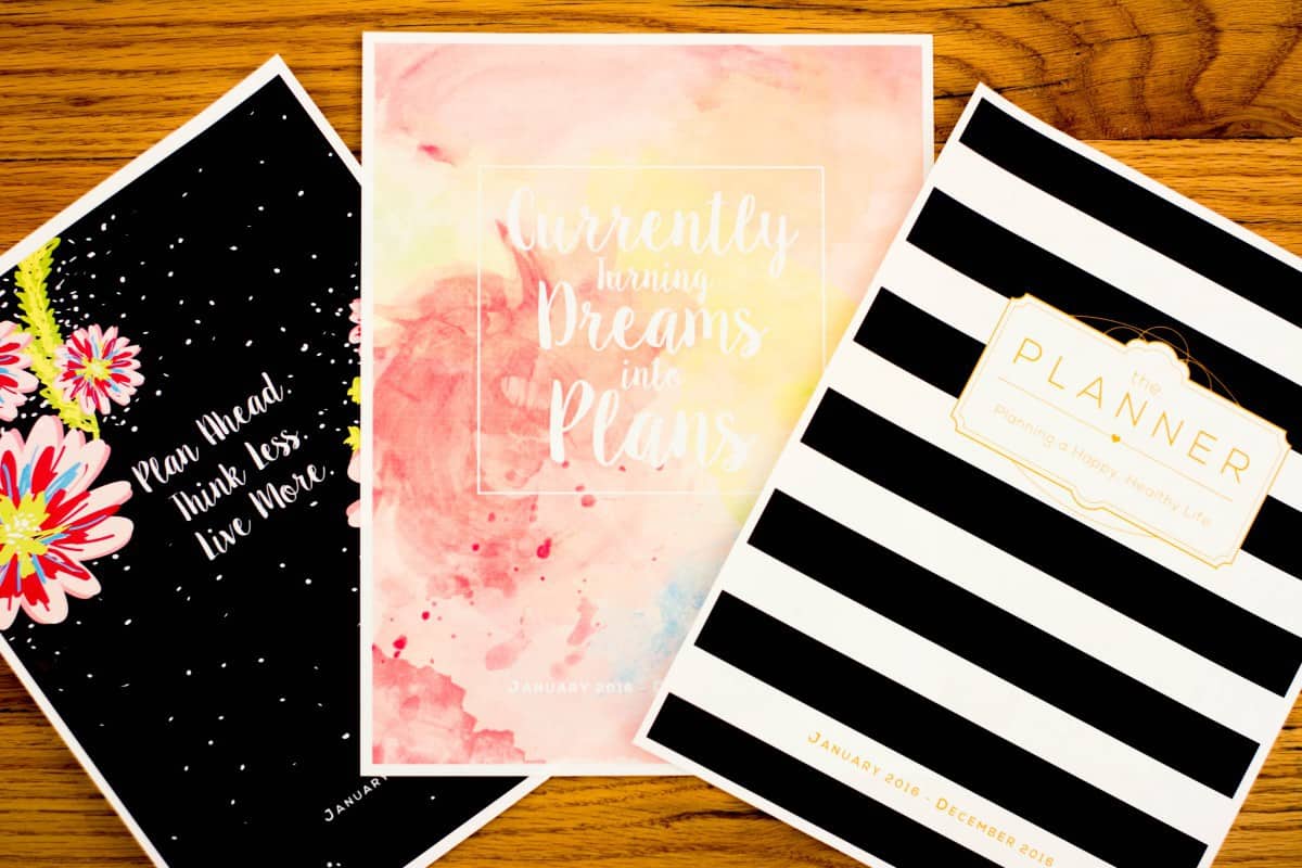
The planner world has a new member. Fitness cutie Lauren Gleisberg has released a printable planner that not only provides space for your everyday schedule and to-dos, but also room to track your workouts and meals. This kind of planner is exactly what the market has been missing, and I know that I have personally wished for the ability to combine my fitness notebook with my daily planner.
It’s literally like Christmas over here.
The Happy, Healthy Life Planner provides a monthly calendar, a weekly schedule, and a weekly spread for health and fitness tracking. Like most weekly planners, the weekly schedule is a two-page spread preceded by the monthly calendar. But each weekly schedule is followed by the weekly fitness tracking page for that week. You can easily flip between them throughout your days. There are also bonus features, like an annual review, monthly goal pages, three covers, and two layouts to choose from.
Did I mention you get all of them for a mere $18? Talk about customizable.
Options Galore
After you’ve ordered the planner, you receive links to the three cover options and the two layout options. You can print them however you want. I chose the last cover option (“Plan ahead, think less, live more”) and opted for the vertical layout in color. I only printed out the month of January, simply because it would be lighter to carry for right now, but the great thing is that I can go back and print the other months whenever I want to. As Lauren explains in the video she released for the planner, you can print it however you want, including in color or black and white. You get to choose which layout, cover, printing options best fulfill your needs.
A Unique Monthly Calendar (Finally)
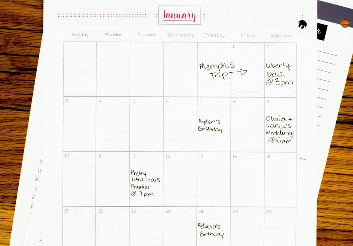
Instead of the two-page monthly layout with a column for notes that we’re all used to seeing, this planner places the monthly calendar all on one page. Since the 30-31 day calendar has been moved to one page, there’s less space to write horizontally. The individual squares are narrow rectangles, so you can’t write as large as you might have in a two-page spread. However, there’s still plenty of room since the boxes are longer in length. As I was filling in my month, I liked that everything was on one page instead of broken up by a spiral. I didn’t spend as much time double checking the day and date while I was writing. It’ll be easier to glance at this monthly calendar to see just what all I have going on.
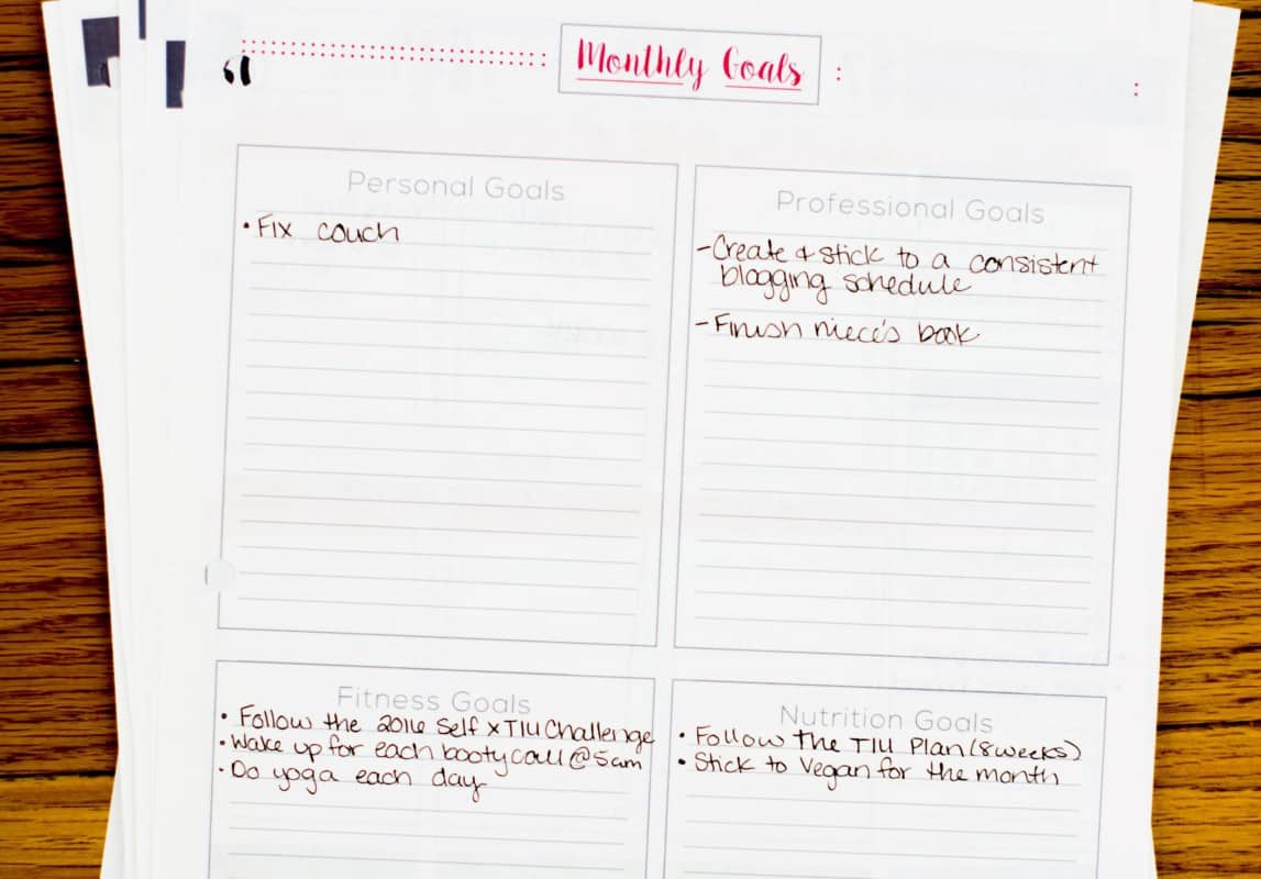
The page next to the monthly calendar is reserved for all of your goals for the month—and I do mean all. There are four boxes for you to write down your personal, professional, fitness, and nutrition goals for the month to come. Each box is spacious so you have more than enough room to write down your goals and any steps or subparts to those goals. Since I try to keep my goals to a smaller number in order to focus on each of them adequately, I had more space than I could use. But obviously, that’s a good problem to have.
Weekly Schedule Layouts Abound
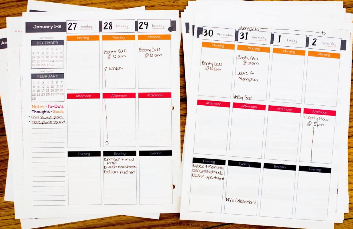
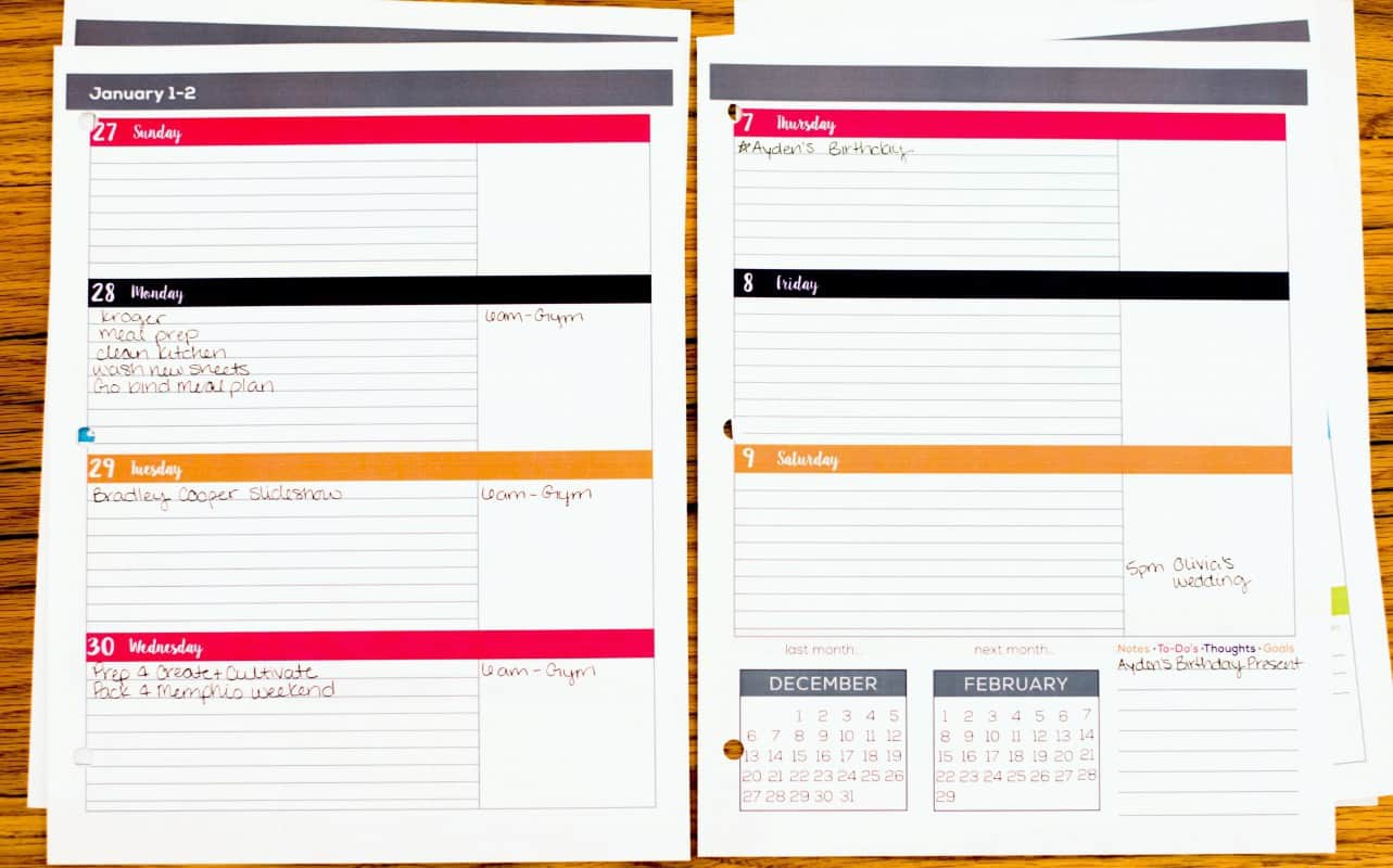
There’s a reason the vertical weekly layout is so common. It’s effective, and Lauren clearly knows that as well. In the vertical layout, Lauren included a Morning/Afternoon/Evening breakdown for each day, a column for notes and to-dos, and small months-at-a-glance for the previous and upcoming months. The planner is the size of a standard sheet of paper, so the vertical layout has more than enough room for you to write down absolutely everything without running into another day’s column. And since the layout is chunked rather than broken down into hours, you can write your tasks next to your appointments easily. I scheduled in my morning workouts, my evening tasks, and my afternoon meetings all together, and it hasn’t become cramped or messy. Basically, you can schedule your to-dos between your actual appointments and plans.
Lauren also knows that every person is different, so a vertical layout will only work for some, and others need a horizontal layout. The horizontal layout comes with all of the same components as the vertical, but the sizing is much different. In the horizontal weekly schedule, each day has a section with lines and a section without. There’s no indication you have to use these any specific way, which means you can do whatever works best for you.
I decided to use the lined space for my to-dos and the blank space for my schedule because I work an 8-5 job and my schedule isn’t harem scarem enough to need more space. My to-dos, on the other hand, are out of control and need the structure of lines. The long column for notes, to-dos, and other stuff in the vertical layout is condensed into a small square in the bottom right in the horizontal layout, though. Initially, I was disappointed by this, but all of the lined space in each day’s row more than makes up for that loss.
The Crown Jewel of the Planner
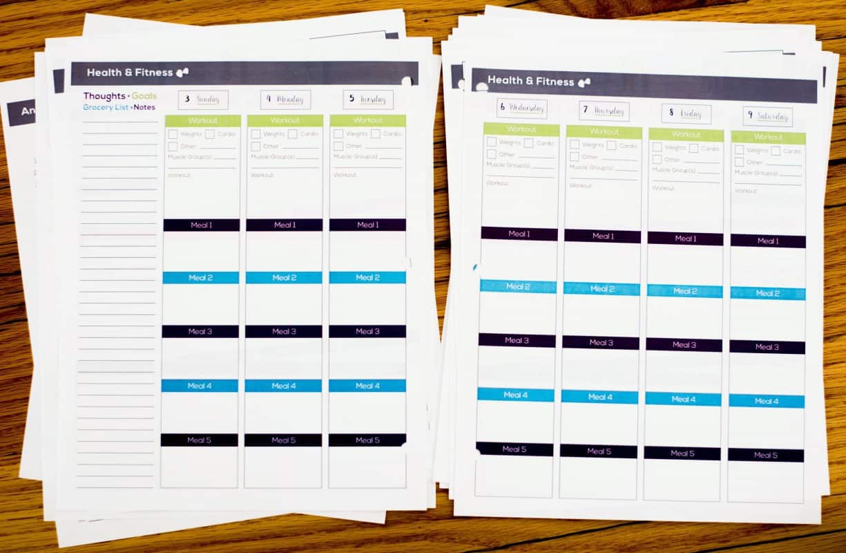
This is a planner from a fitness junkie, so the whole point of creating it was to provide a place to track your health and fitness journey. Well, Lauren delivered on that. The two-page spread following the weekly schedule provides everything you need to track it all. The weekly fitness tracking mimics the vertical weekly layout. Each day has a column with space to write down your workouts, including the type of workout and each meal you eat that day. In the workout section, you check off whether you did weights, cardio, or other (like yoga), write down which muscle group you targeted, and what the exact workout was.
Below the workout section is the meal tracking portions. There are boxes to write five meals, which keeps in line with Lauren’s meal plans and many other popular meal plans. The boxes aren’t massive, but there’s enough room to write what you ate and how many calories it was, if you count calories.
However, even with all of these sections, there’s one thing missing. Unfortunately, there isn’t a designated space to track your water intake. Some people might not track the amount of water they drink each day, but many health and fitness-minded individuals do try to monitor it to stay hydrated. I’m one of those people, so the lack of designated area is a bit sad for me. My fix: I simply draw check boxes at the bottom of each day’s column to mark off each water bottle I drink in a day.
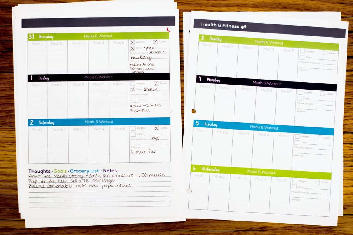
Lauren’s fitness and health tracking pages also come in a horizontal option. Instead of each day beginning with the workout details, it begins with the meals. From left to right, you start with Meal 1 through Meal 5, and then the far left is for your workouts. The individual spaces for each meal are a bit narrow, and I found it hard to contain my giant, kindergartener-like writing to them. However, the workout portion is just about the same as the vertical layout’s, and that I found relieving. The bottom left of the horizontal fitness layout has lines for you to jot goals, notes, grocery lists, and thoughts. It’s a wide row instead of a column, which is ideal for writing down your thoughts and goals, but it makes for a difficult grocery list for me to navigate.
Consistent Color Scheme
I was a little worried about what it would actually be like to use this planner because you essentially have to flip back and forth between your schedule and your tracking pages. When I first pulled open the PDF on my computer, I saw that the month of January had a pink, orange, and purple color scheme. I assumed that each month would have its own individual color scheme like other planners with a similar layout. I was wrong.
Instead, each month is orange, pink, and purple, and the fitness tracking pages are green, blue, and purple. Lauren assigned a specific color scheme to the two main components of the planner, and it makes all the difference in usability. I know exactly which layout I’m looking at as I quickly flip through the planner. There’s no getting confused between the weekly schedule and fitness tracking pages. In my opinion, this is the best way to create a clear difference between the two, and to keep the entire planner from becoming overwhelming.
The Happy, Healthy Life Planner is Lauren Gleisberg’s first foray into the realm of planners. She’s done an impressive job with it, too. It’s spacious, organized, focused, and provides enough customization to fit anyone. If you’re looking for an affordable planner that will also help you remain centered on your goals and healthy New Year’s resolutions, I highly recommend this planner.
Follow Terra on Instagram: @terrabrown3
Last modified on January 3rd, 2024



Show Comments +