2017 UPstudio Planner Review: Upgrades Galore
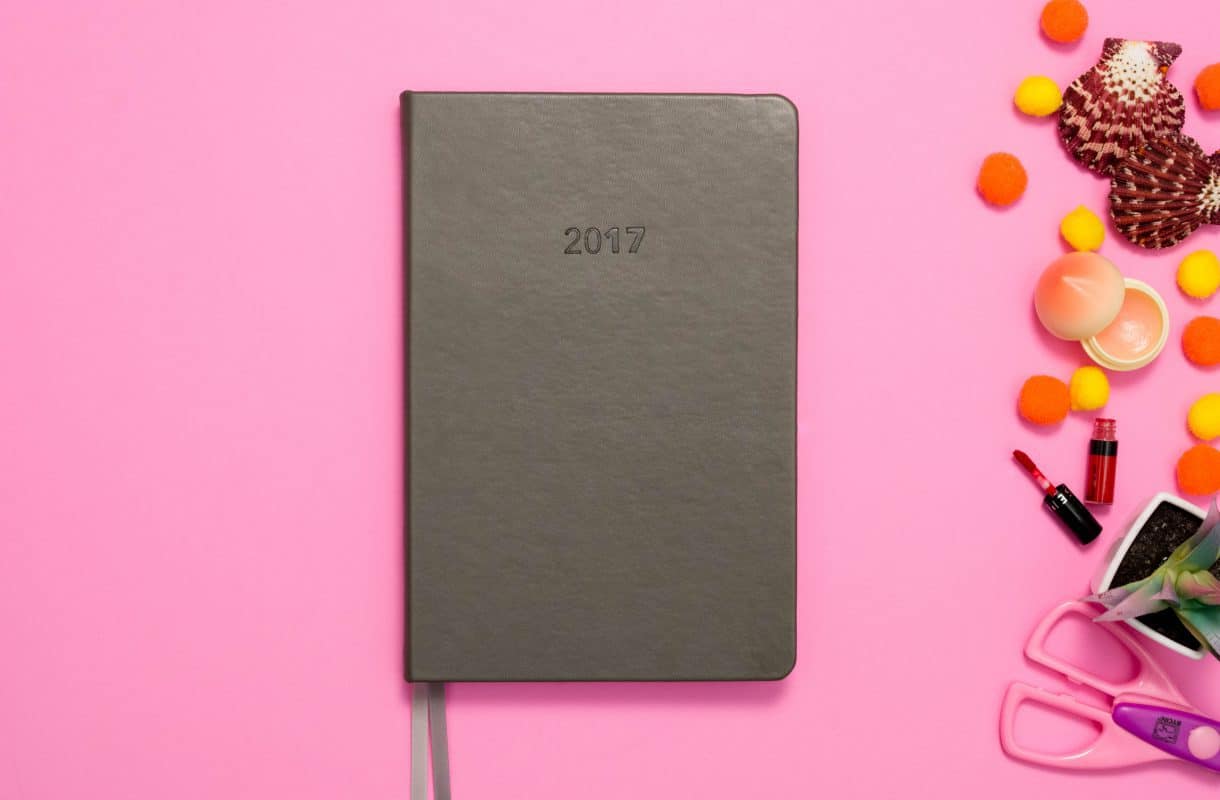
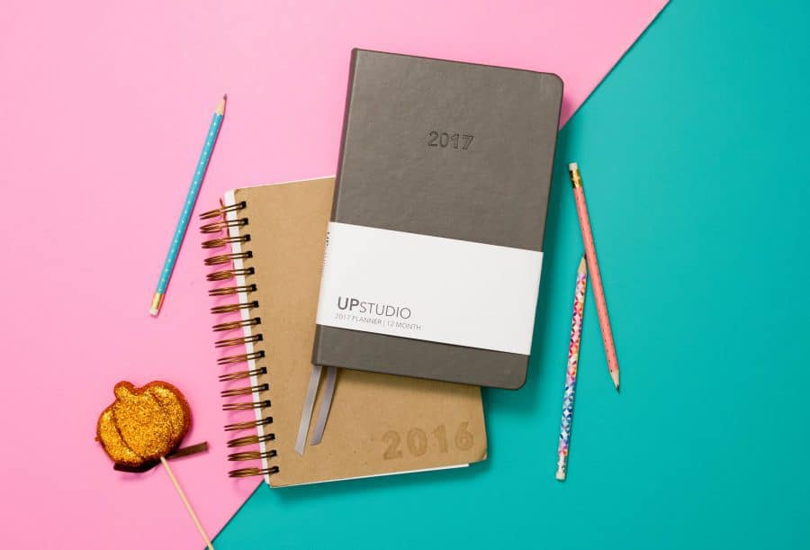
To say that UPstudio gave its 2017 planner a makeover is an understatement. Like Taj from Clueless, this planner is practically unrecognizable. The 2016 UPstudio was a brown cardboard, wire-o bound planner. It was simple and without embellishment.
The 2017 UPstudio planner, in contrast, is sleek and sexy. It’s bookbound in a smokey-gray, leather-like fabric, and it’s taller and thinner than the 2016 version. The UPstudio planner has come into its own.
New Year, New UPstudio
All of these changes are a big deal. We’re talking a complete overhaul of a planner. It’s now a beautiful, professional tool that wouldn’t be out of place in the most formal of work settings. However, even with all of these changes, UPstudio remains true to its roots.
That Signature Look
The weekly layout continues to be the signature layout. The top half of each days’ column has an hourly schedule, but the times are small and understated. This allows you to use the space however you see fit. You can follow the schedule provided or make your own.
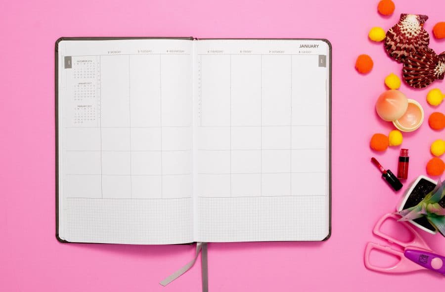
Below this are three boxes. Each box can be used for whatever you want them to be used for. Whether that be to track meals, exercise, tasks, or your family, it doesn’t matter. These boxes are blank, so you can use them however you feel is best. It can change from week to week as well. Whatever your top priorities are that week can be put in these boxes, or you can use them to track your healthy habits. There is so much flexibility here that it’s almost criminal.
Set Some Goals
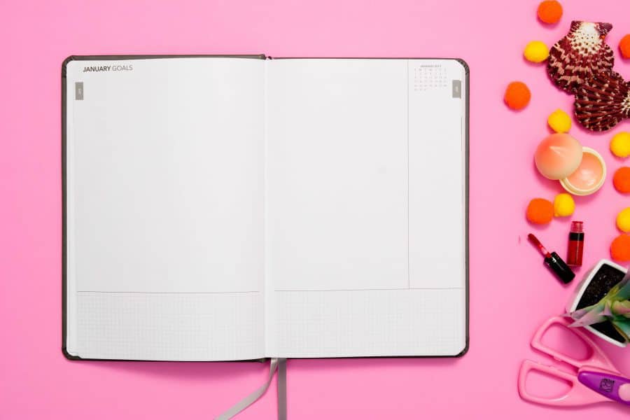
The monthly calendar is just the same as well, but for 2017 the monthly goal-setting page has been expanded into a two-page spread. Now there’s more room for you to brainstorm your monthly goals, plan them out, and get detailed with how you’re going to achieve those goals. At the bottom of both pages, there’s a gridded section for you to use however you want; plus, the right-hand side has a blank column as well. This column is a great place to write down the finalized goals, ideas, or even a task list.
The 2017 UPstudio Planner and You
If you’re the kind of person who likes to control the way things are laid out in your planner, then you’ll really like the weekly and monthly pages in the 2017 UPstudio planner. You have control over what goes where and plenty of room to jot things down. Few planners offer this kind of natural control. Be aware, however, that there’s not room for lengthy to-do lists on the weekly layout—so if you love your to-do lists with all your heart, this layout won’t work for you. UPstudio is made for those who crave freedom and versatility.
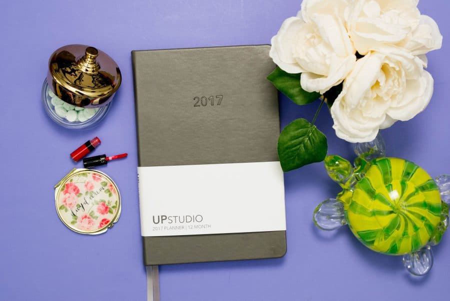
Did I mention that even with all of these classy upgrades, the 2017 UPstudio planner is only $40?
Follow Terra on Instagram: @terrabrown3
Last modified on January 3rd, 2024





Show Comments +