Day Designer for BlueSky Review: Beauty, Brains, and Affordability
Day Designer is the Beyonce of planners, which makes their collaboration with BlueSky “Lemonade.” The second collaboration between the two planner companies just released, so if you’re not freaking out you can’t sit with us. Just kidding (kinda, not really).
If you aren’t freaking yet, you will be after this review (and the video below).
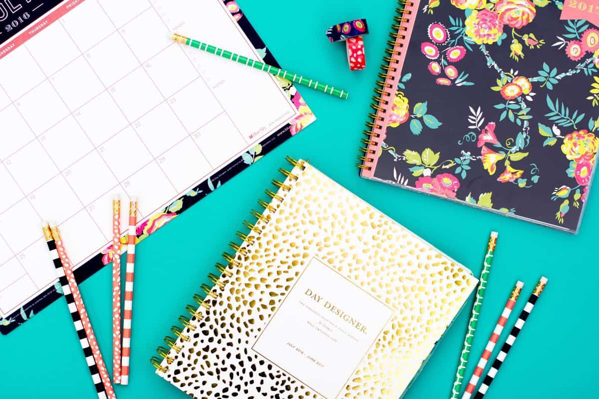
There are so many pieces in this collection that it’s honestly difficult to narrow it down to one choice. In fact, I couldn’t choose just one. I chose two different planners (and several accessories) to review here. The first is the Daily Monthly in Gold Spotty Dots, and the second is the Weekly Monthly 8.5X11 in Navy Floral. The tug-of-war between daily planners and weekly planners is a serious one, but it’s pretty hard to chose a winner between these two.
The Weekly Planner
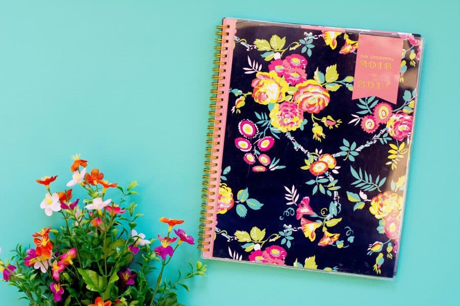
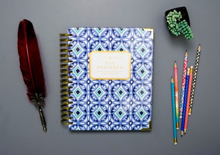
For this collaboration, Day Designer made several different weekly planners. There’s a size for everyone and seven (SEVEN!) different covers to choose from. I went with the Navy Floral because spring is in the air, and it’s a “make your own cover” planner. So it comes with the navy background, but you can insert your own cover in the clear pocket easily. Variety is the spice of life, right?
This particular weekly planner is the largest available (8.5×11) and so worth the space. If you have larger handwriting, a lot to write down every day, and paper-claustrophobia, then I recommend this size, especially because it’s a horizontal layout.
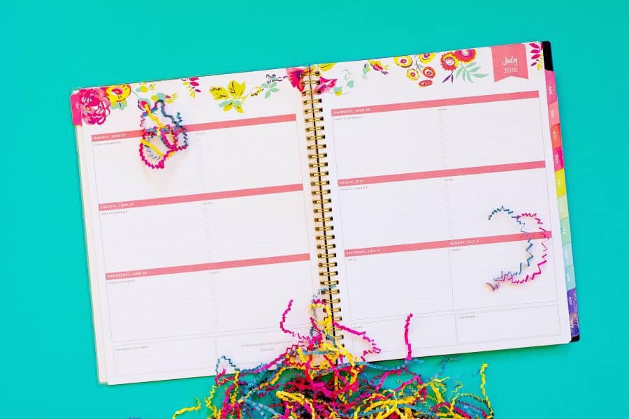
Even though I’m not a huge fan of horizontal layouts, this one is actually nice because it still has most of the elements I love from the Flagship Day Designer. Each day has a dedicated to-do list space, room for you schedule, and the week includes the top three tasks/projects, and the gratitude box. However, the gratitude and top three are for the entire week, not just one day. Since there aren’t hourly times listed in each day, there’s the issue of writing your schedule and not having room for new additions as the week unfolds. It can still work, but that is something to keep in mind before you purchase and as you use this planner.
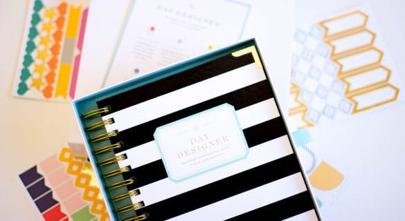
Aside from the layout (and goal pages, discussed in a bit), the weekly planner also has a nice section of note pages at the back, a laminated holidays/important dates page, and nice, open monthly calendars throughout. Plus, the monthly tabs are arranged in a rainbow, and that’s just fun!
The Daily Planner
Naturally, the daily planner in this collection is amazeballs. It has the best elements from the Flagship Day Designer, plus some layout changes that I genuinely love. Right off the bat, it’s a little bit bigger than the Flagship. The paper is larger, and of course that means the entire thing is, but since the cover is thin, frosted plastic, it weighs pretty much the same.
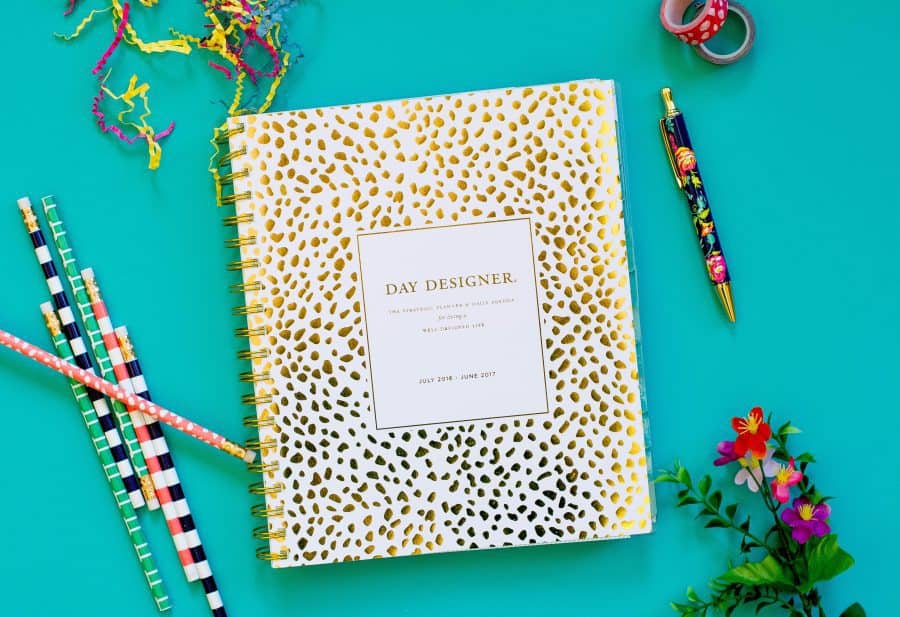
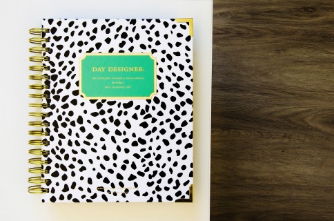
There’s only one daily planner in this collection, so Gold Spotty Dots was the only cover to choose from. I personally love their spotty dots pattern though (have you seen my Black Spotty Dots Flagship??). The inside is a soft sea foam green, which seems to really be the perfect counter to the gold foil of the cover. The tabs are easy to flip through as well.
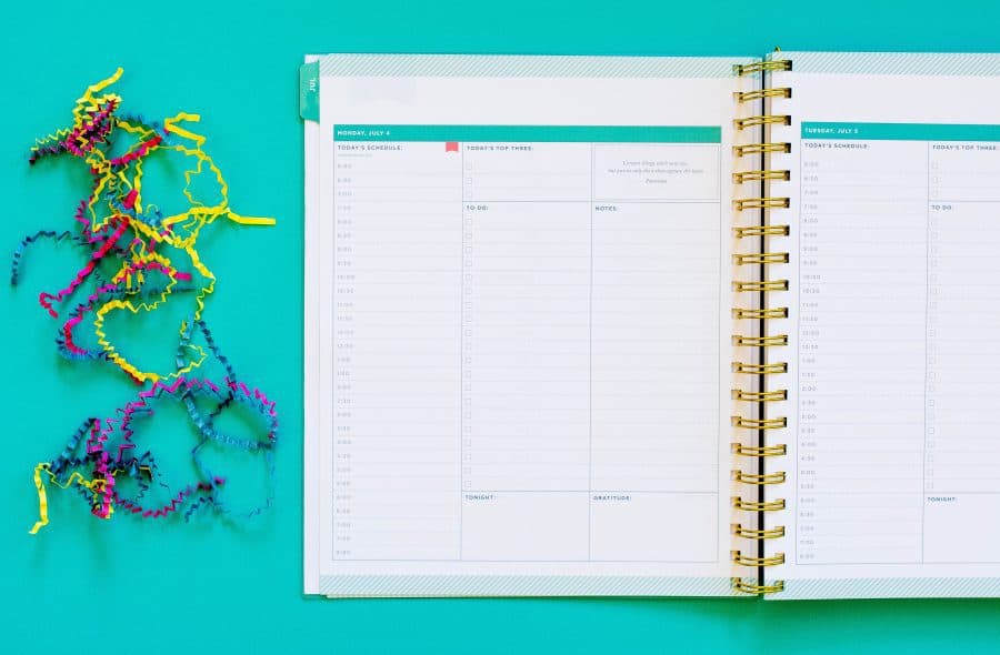
Back to the daily layout—it’s composed of three vertical columns. The first is the schedule (6 a.m. to 8 p.m.), and it’s broken down into 30-minute increments. The second column has three sections. The top is for the top three to-dos that day, the middle is your to-do list, and the bottom is the “tonight” box. The tonight box can be used for dinner plans, TV shows, or even your nightly ritual. The last column begins with a motivational quote, then has a notes box, and ends with the daily gratitude box.
It might sound silly, but the vertical notes box is a game-changer for me. I’ve always used the notes sections for my daily workouts and meal tracking, but it’s much harder to fit it all in a horizontal box. A vertical box is easier, and the three columns all look nice laid out side by side.
I’m willing to go on record saying this daily planner is every bit as good as the Flagship, aside from the shorter schedule. But really, I shouldn’t have plans past 8 p.m. on a weeknight anyway.
The Goal Pages
Day Designer is basically infamous for their goal setting worksheets. Luckily they didn’t cut them out of their BlueSky collection. The goal setting pages in Day Designer for BlueSky planners are different than the ones in the Flagship—though I think they’re just as useful and valuable. There are four pages. The first, “Start With The Big Picture,” is where you write down your goals, dreams, and what you want your life to be like. It’s a page for you to jot down whatever comes to mind and do some personal brainstorming.
The second page is where you set your goals. The planner has four sections for you to divide them into: Personal, Family Friends & Relationships, Heart & Spirit, Financial, and Work Career or Study Goals. After you categorized your goals, there’s a column for you to write down how you’ll accomplish each one.
Page three is about designing your days. Basically, you write down the morning and evening routine you want to guide you to success. There are a few suggestions included to inspire you, but there’s also a ton of room for you to write the specific things you want to do at the start and end of your days.
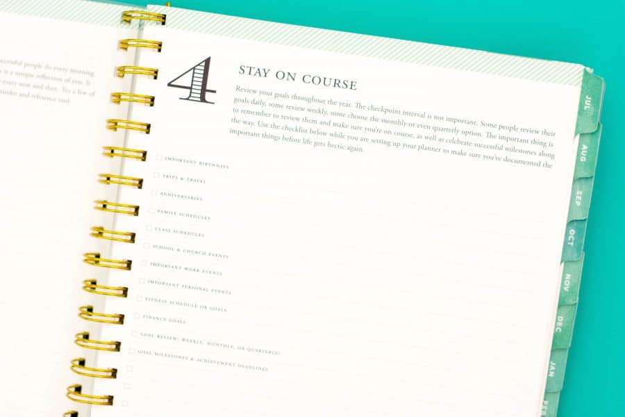
Finally, page four is there to help you review and track your goals throughout your planner. It has a list of things you might need to write down for the months to come, and room for you to add to it as you need. You use this list when you’re setting up your planner so you have your goal check points and important dates documented for the next twelve months. The best way to ensure success is to prepare for the future.
Follow Terra on Instagram: @terrabrown3
Last modified on June 1st, 2017



Show Comments +