2016 Day Designer Flagship Review: Out With the Old, In With the New
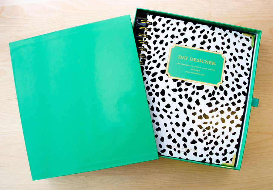
At precisely 12:21 p.m. on Saturday, November 7th, my 2016 Day Designer arrived.
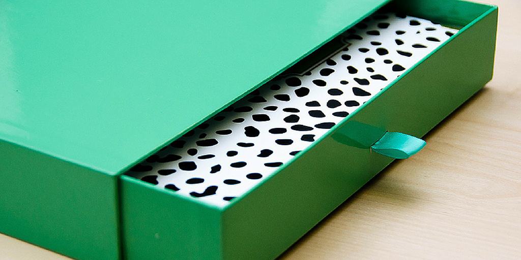
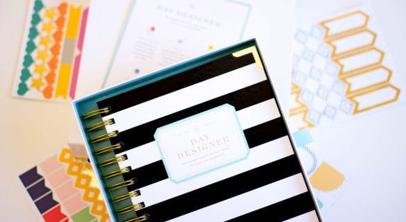
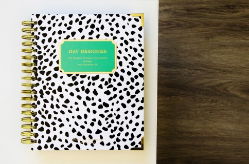
My mail is delivered promptly at noon, but I didn’t want the mail man to judge me for waiting on him, so I forced myself to pace through my apartment for 20 minutes. He was still at the mailboxes when I got there, and he definitely still thought I was strange, but I didn’t care because I finally had my new planner. I rushed back up to my little abode, ripped through the box, and pulled out the precious seafoam green drawer that held my 2016 DD in Spotty Dots. I’m not saying I didn’t hold it up like Simba in The Lion King, but I’m not openly admitting I did either.
Now that I’ve had it for a few days, and I’ve stopped caressing it (for the most part), I’m ready to give my honest review of the new layout, updated materials, and overall usefulness of the 2016 edition.
Disclaimer: I purchased my first Day Designer at the start of 2015 (okay, fine; it was actually November of 2014), and I’ve been obsessed with the planner ever since. The 2016 edition is my second Day Designer. I’m a complete organizational freak who lives and dies by the planner. Really, I’m obsessed with planners.
Buckle up, it’s going to be a wild (but organized) ride.
Materials
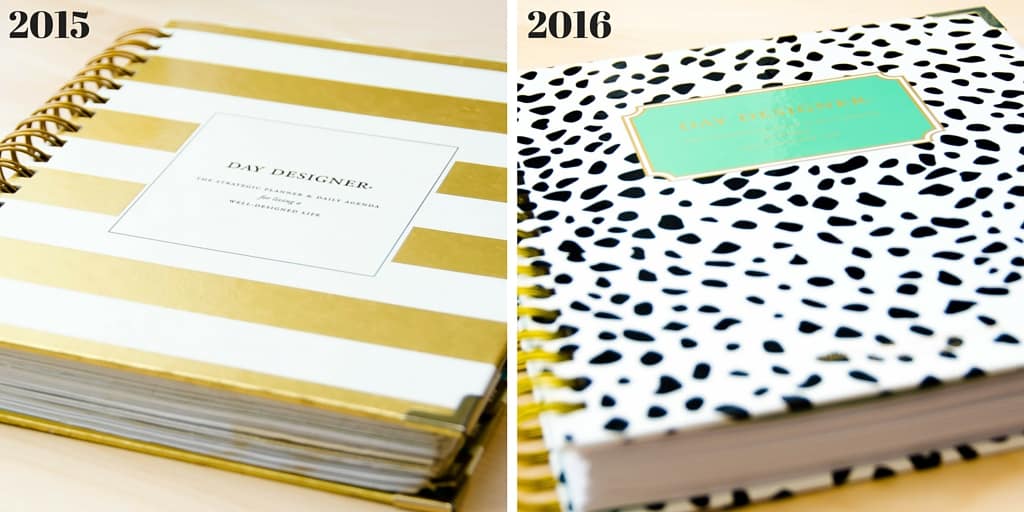
In comparison to the 2015 edition, Day Designer really stepped up their game with the materials in 2016. In total, they changed the paper quality, removed the 12 glossy notes pages at the start of each month, and redid the inside pocket. We still get the great durable gold coil to hold the pages together, and the cover is still glossy, thick, and stiff. There’s no concern that it’ll bend. The corners still have gold corner protectors, but they’re larger than the 2015 version. Hello, extra protection!
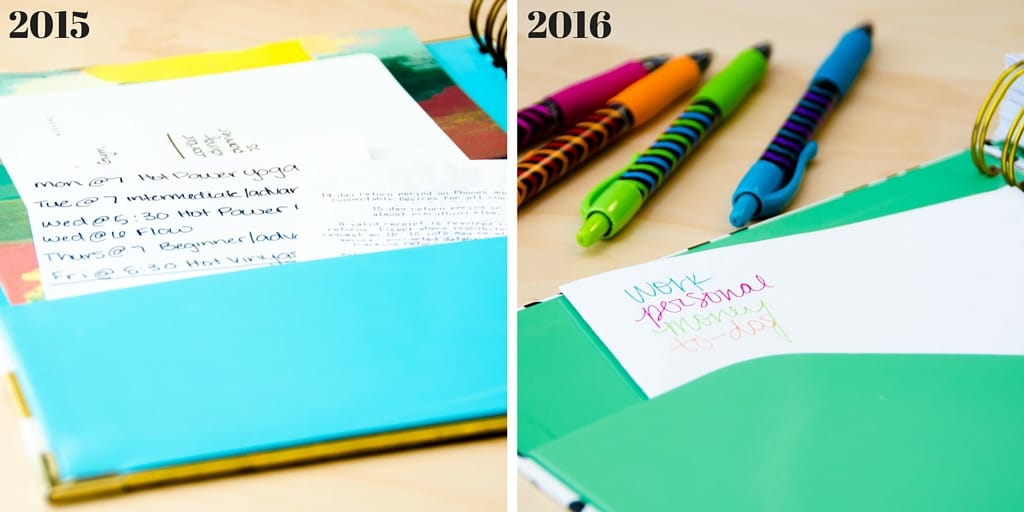
One of my favorite parts of this new planner is the updated cover pocket on the inside of the front cover. It’s taller and at an angle, so the papers I stuff in there will stay in place. The folder in the 2015 version was shorter, which left me constantly having to slide the papers back in. This new folder is going to be one of those little godsends that I don’t notice on a daily basis, but make a world of difference.
The biggest update however, is the paper weight. I loved my 2015 planner, but the paper was a little too thin for my liking and my favorite felt-tipped pens. My favorite pens all bleed through the paper so two or three days become jacked up if I try to use them (not that I color code my planner anymore). That won’t be a problem in the new year. The paper inside my new DD is much thicker (90 GSM!) so the ink of my beloved Paper Mate Felt Tipped pens won’t bleed through, and there won’t be as much of a problem with it ripping around the coil, which is just the absolute worst.
Another big change from January 2015 to January 2016 is the monthly divider pages. In the January 2015 version, each monthly tab is attached to a thick glossy notes page that is a bit inconvenient to write on because ink smears across it and doesn’t absorb into the paper, but it’s pretty so I got over it. In the new one however, that glossy paper is gone, and its absence hasn’t detracted the aesthetic. Now the monthly tabs are attached to the last day of the previous month and followed by the monthly calendar. This paper is extra stiff though, and that will prevent the monthly tabs from ripping off. It also just feels really nice between the fingers.
Layout
The layout of the 2016 edition has a lot of updates from the 2015 version. In general, the entire planner is cleaner and more streamlined, if that’s even possible. It has the signature layout that I love, but overall, the whole look is fresher and lighter.
Monthly Layout
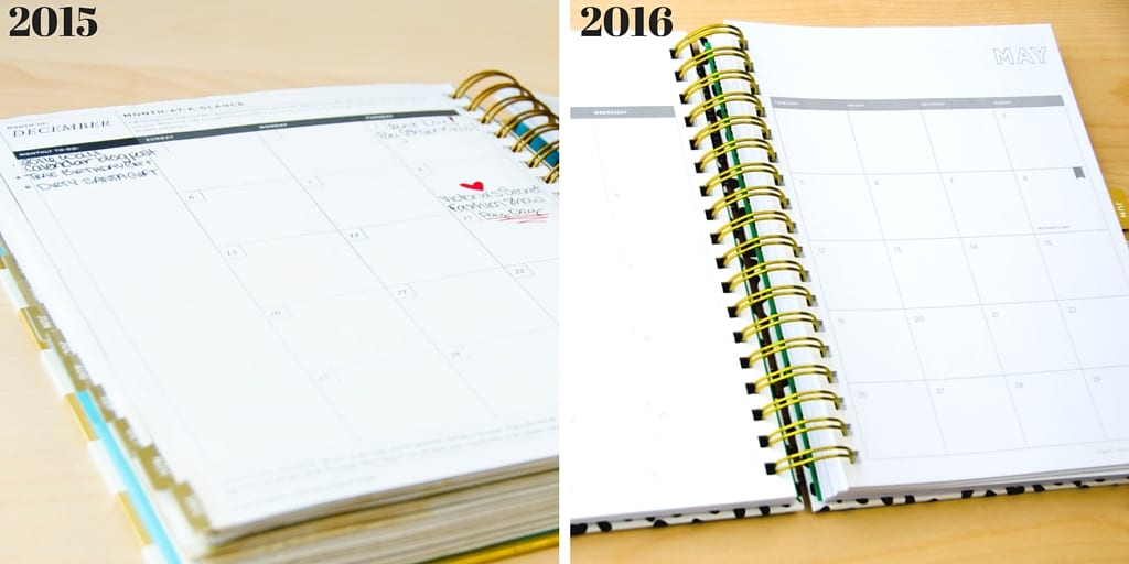
In contrast to my last DD, this planner’s monthly pages are simple. The monthly calendar for 2015 had thicker and darker lines and monthly challenges at the top of the page. The entire page is clean, and the large chunks of text for the monthly challenges are gone. There’s a long column to the left for me to jot down goals and tasks for the month, and there’s tons of space in general for me to write down anything I want above the calendar, like quotes or themes for the month. I’m also thrilled that national holidays are now included in the monthly (and daily!) calendar. So now I don’t have to guess what weekend is Labor Day (I was definitely wrong this past summer).
Daily Layout
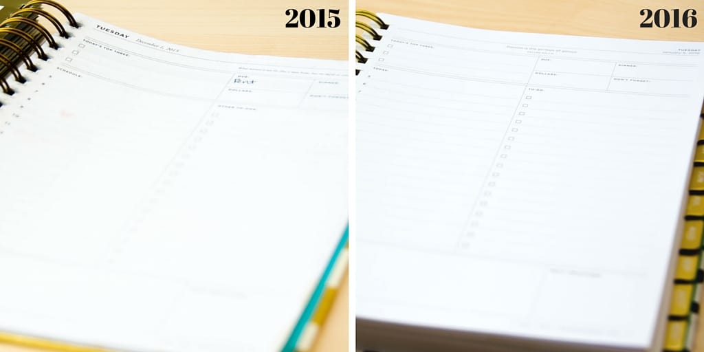
The whole point of Day Designer is the highly organized and effective daily layout. I mean, this thing is pretty much every girl boss’s dream. A 5 a.m. to 9 p.m. schedule means there’s more than enough space to accommodate all of your meetings, appointments, and social engagements. I can’t imagine there’s a schedule too hectic or busy for this planner to handle.
Right next to the magical schedule is the promised land: A 17-item-long to-do list. This is not a drill. No matter how full my day is or how many articles I have to write for work, I always have enough room to write it all down in a calm and orderly fashion. Essentially, it changes the whole planner game.
Day Designer’s goal is to help customers create a “well-designed life,” which means having a clear focus each day so you can reach your goals. To make this easier, the DD has a section for your most important tasks called “Today’s Top Three.” This is where you can write the tasks that help you get closer to your goals. This isn’t where you write “rotate laundry.” Of course, it also includes the smaller boxes for “Due,” “Dollars,” “Dinner,” and “Don’t Forget” that keep the whole planner in control, and the daily notes and gratitude sections are still present. A place for everything, and everything in its place, amirite?
My favorite change in the daily layout is related to aesthetics more than functionality. The daily quotes are now in a sans serif font and centered above the page. This lends them some prominence on the page, and they’re much, much easier to read. I love a good inspirational quote, so I’m probably more excited about this change than other people. But you just never know when you might need a little pick-me-up, swift kick in the butt, or just a quick reality check.
The Weekend Pages
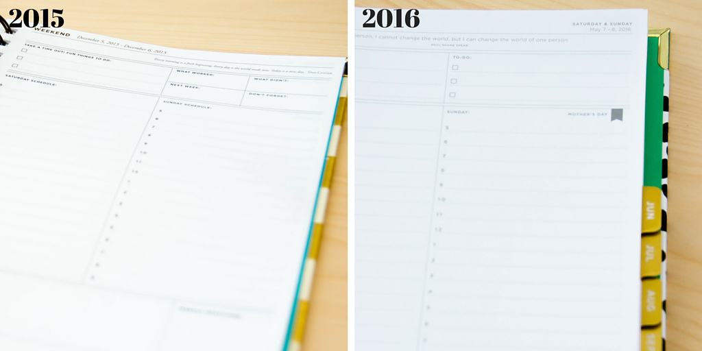
Day Designer combines Saturday and Sunday onto one page, vertically. You get the same 5 a.m. to 9 p.m. schedule, plus three to-do slots above each day’s schedule. This is a big improvement from the January 2015 edition, which didn’t have a designated to-do spot over the weekend.
However, the grandest, most exciting change in the weekend pages is that there is now a row at the bottom of the page for the next week. There are small boxes for each of the days in the next week where you can write down whatever you need to know in order to prepare for the coming week. You can use this space for meal planning, upcoming appointments, or anything else you want to remember. Personally, I’ll likely use this space to jot down workouts for the next week. It might not seem like a big deal, but I promise you it is. Think of it as a tool for you to glance at throughout the week when making plans for the coming week.
Extra Features
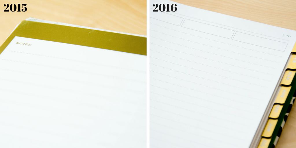
Since the glossy monthly tab pages, which also serves as a space for notes, from January 2015 received the boot in this edition, there aren’t as many note pages scattered through the planner. Day Designer made up for this by including two full note pages in the front and back, as well as a few full note pages scattered throughout the planner. Some months have a note page before the monthly calendar, but it depends on what day the previous month ends on (because the month calendar always starts on the left side). Overall, there are fewer note pages in this edition, but I never even got close to using all of the space in my January 2015 edition anyway.
My biggest complaint with the changes in the 2016 edition is related to the important dates section. The problem is that it doesn’t exist anymore. I used this space in my 2015 DD for upcoming dates, like weddings, so I would know when they were if need be. Since this isn’t included in the new planner, I’ll have to write them down on one of the notes pages. This feature was replaced with a two-page monthly overview for the entire year. There’s no room to really write anything, and if I need to look up a date then I’m more likely to flip through the monthly tabs.
A big draw of the previous Day Designers was the planning pages in the beginning. However, in the 2016 Day Designer, the pages have been pared down. There are now just four pages for me to plan out my goals and intentions for the year. I’m actually okay with this because I found the original work pages to be a little overwhelming, and I definitely didn’t stick to the goals I set (but that’s a whole other story).
The four planning worksheets included are still superb though. It’s a more concise space, and the exercises are more focused. There are worksheets for me to create my vision for the year by narrowing down my three big ideas, a page where I can jot down tasks, goals, and ideas for the year, a space to break down my 2016 goals by category and time frame, and a chart for making my goals more manageable. If you want the full set of original planning pages, they are available for individual purchase from Day Designer.
My Verdict.
It’s beautiful and I love it. 2016 is about to be my bitch.
Follow Terra on Instagram: @terrabrown3
What’s your favorite thing about the 2016 Day Designer Planner? Tell us in the comments below!
Last modified on June 1st, 2017



Show Comments +